Celonis: When bold is almost an understatement for brand, software and attitude
James Bond on TikTok - world-class meets exciting, self-confident design: We develop the visual communication for a pioneer in the software industry.
Brand Deluxe please
"Brand development is not a democracy, but a series of strategic decisions." Under this motto, we work with Christian Flaccus, Chief Design Officer at Celonis, to develop a bold and strong brand experience that does justice to the decacorn and tech leader.

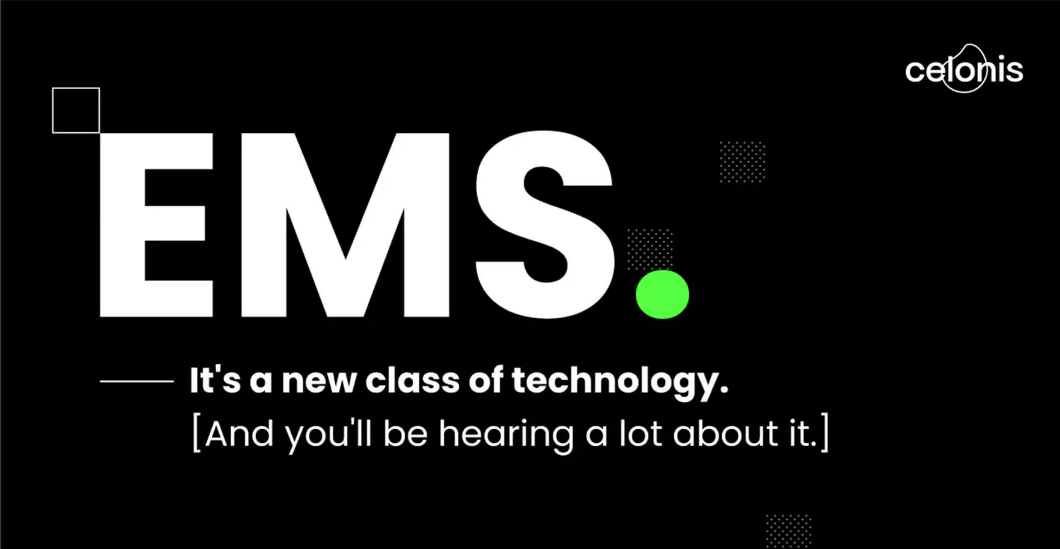
When you do so much more than the supposed competition and you mislead potential customers with the usual product descriptions and promise far too little, it's time for a category of its own. And so the Execution Management System (EMS) was born from the already established terms of Process and Data Mining. And to herald this new era visually, Celonis commissioned us with the relaunch of its brand design. The goal: an unmistakable visual identity that makes the brand's character tangible at all touchpoints along the customer journey - and is just as impactful as the new product.
Design with depth
To ensure that the brand design is not mere decoration and thus diminishes the value of the brand and the product, it is particularly important to us that there is a clear connection and that the visual language is fed by the values of the company and the fundamentals of the product. Rounded off by a pinch of coolness with a wink to really stick in the mind. Particularly important here were
The result speaks for itself
Go Super duper Bold OR Go Home
Big data, small data - the main thing is data
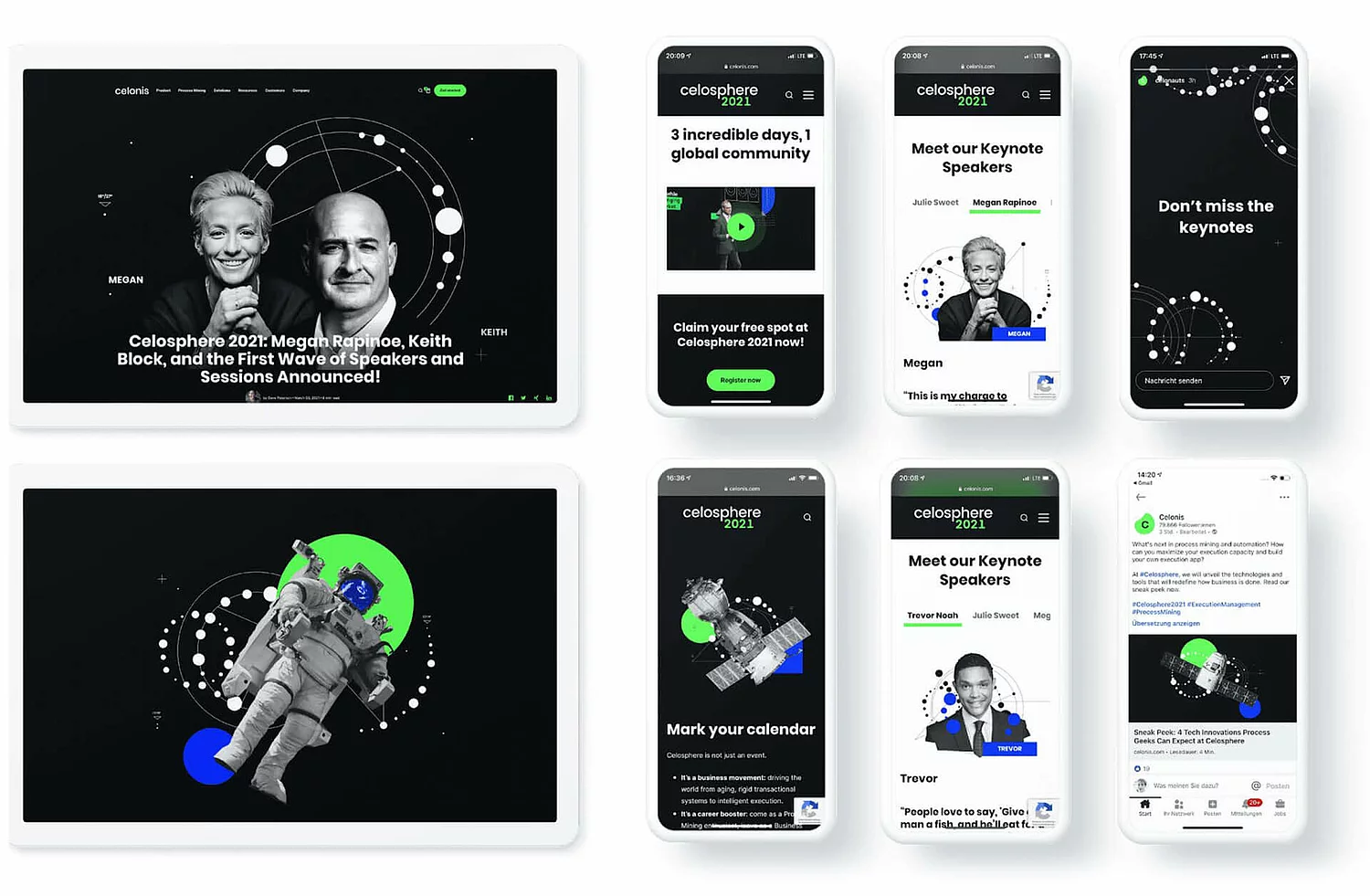
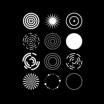
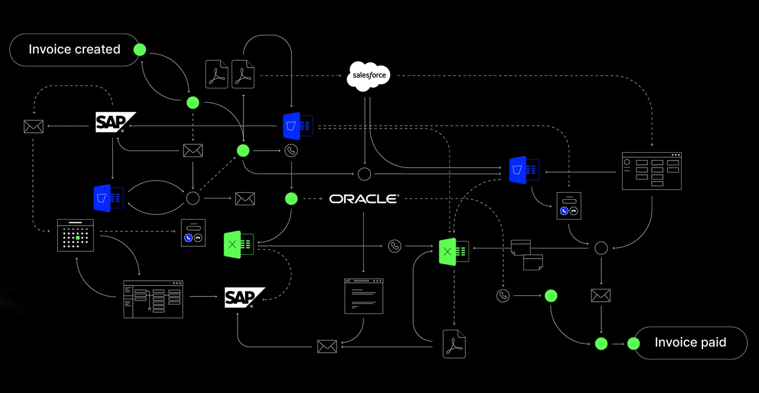
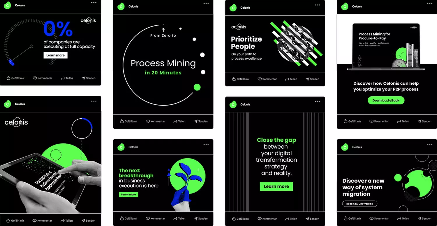
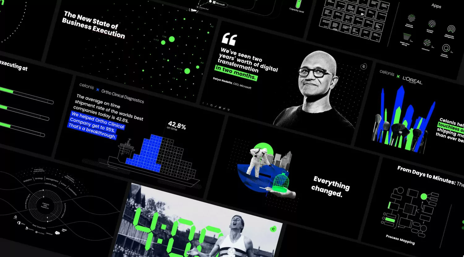
The EMS is the melting pot for all process-relevant data. It brings together this data from different systems, analyzes it and shows specific options for action - that is the core of the Celonis software. This is also reflected in the brand assets: data and the information obtained from it are the central motif of visuals and graphics.
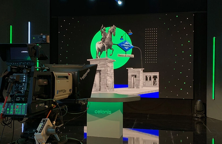
We use collages to bridge the gap between the abstract world of data analysis and its impact on day-to-day business. This makes it easier for less tech-savvy target groups in particular to access the Celonis brand and its product.

World of color: no compromises
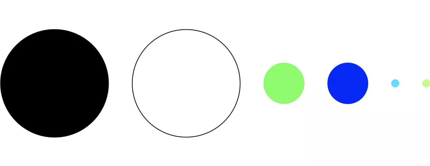
"Black on white" is the epitome of clear, unambiguous communication. By choosing these two primary colors, we underline the brand's self-image: serious, data-driven and always to the point.
The secondary colors, used discreetly, provide the necessary visual appeal. This interaction creates a unique appearance that emphasizes the pioneering spirit of the brand. Celonis does things differently from the competition - visually too.
Brand staging is omnipresent
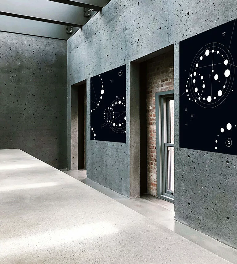
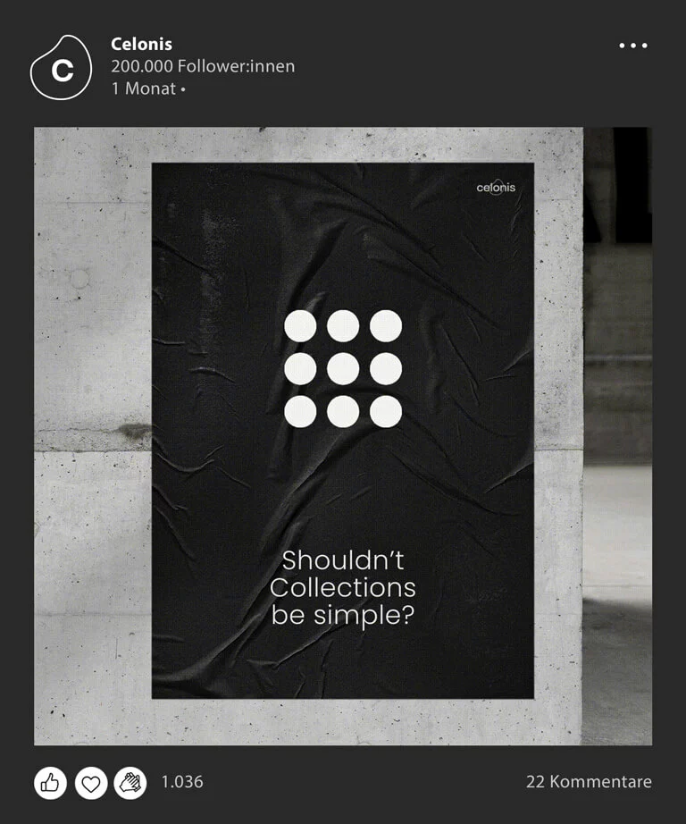
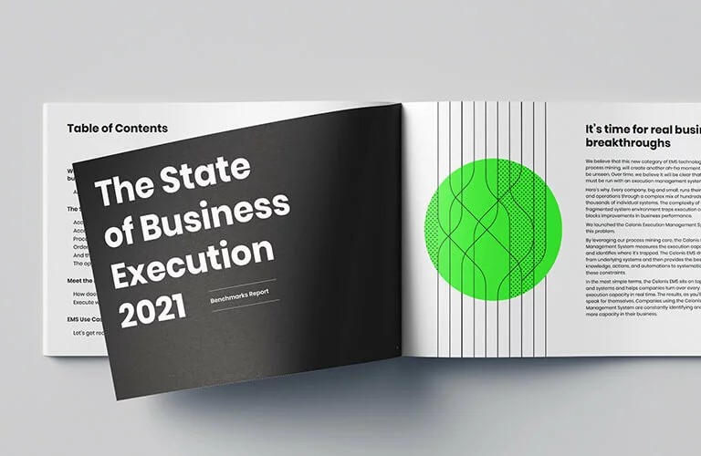
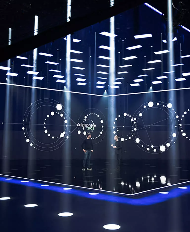
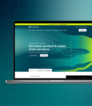
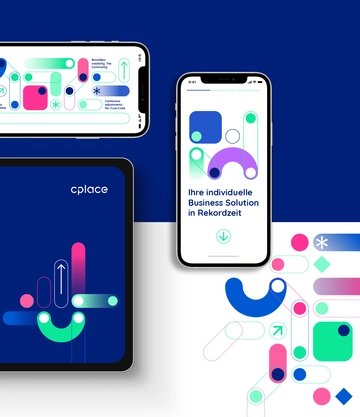
Our assets and visuals can be found at all touchpoints along the customer journey.
