Scope 1, 2 or 3: On the right track thanks to Makersite
Award-winning supply chain AI solution in search of an all new brand
Market pioneers need a matching look
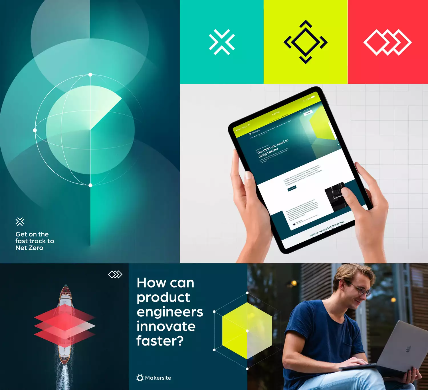
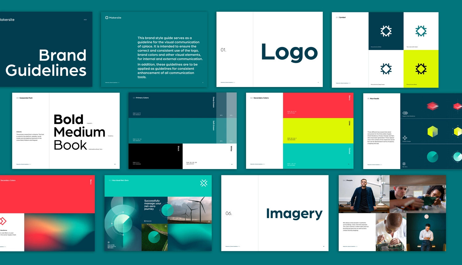
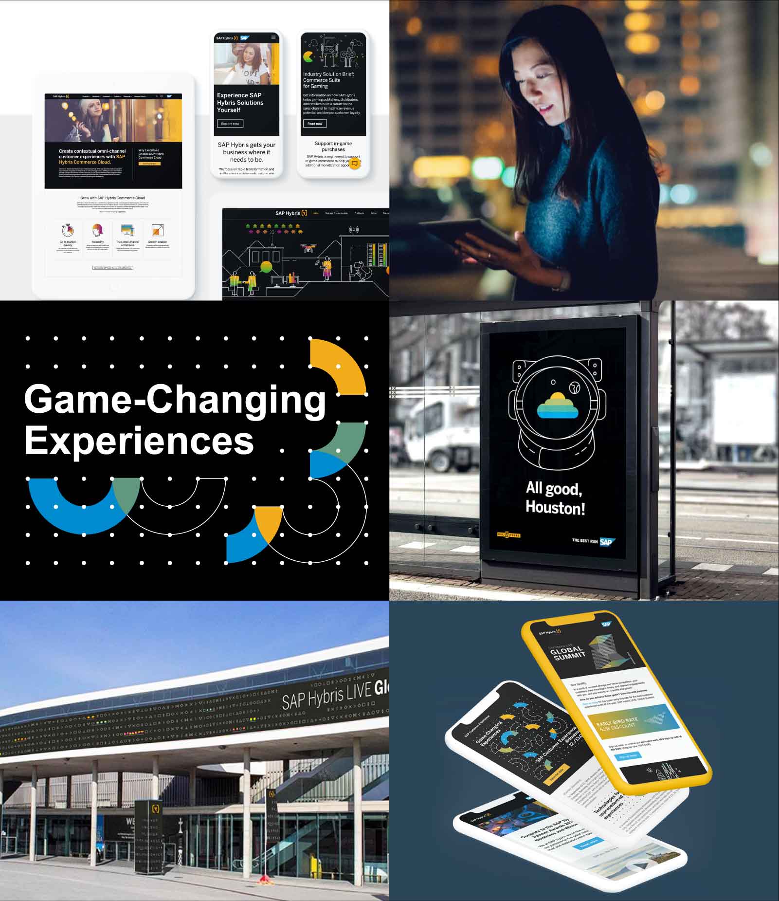
The Makersite Brand: Shiny and New
The product is award-winning. The company is driven by high standards of professionalism, innovation and sustainability. And the brand? After we took care of it, it also fits in with the ambitious mindset that Makersite lives by in all aspects.
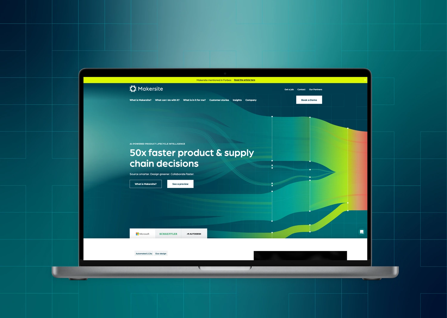
As we already worked out in the brand strategy phase, Makersite acts according to the principle of "Source smarter. Design more consciously. Collaborate faster." They also need a strategic brand direction that fully reflects this, as well as a brand design that visually demonstrates it.
This is expressed, for example, in primary colors that are in the classic green range, which one would directly associate with sustainability, but which close the gap to the spacey-innovative drive that Makersite embodies and thus create the connection to the software world. Gradients set flowing accents. Key visuals symbolize the three pillars on which the Makersite portfolio is based. And abstract grid graphics build a bridge to the data-based precision that runs through all aspects of Makersite. They give this AI solution the impetus to conquer the supply chain market at lightning speed.