Bayerische Hausbau: Home sweet investment object
Bayerische Hausbau's brand deserves to present itself as elegantly as the real estate company's sought-after properties

From Munich’s Joseph Pschorr Building to the Bikini Berlin
Bayerische Hausbau's buildings shape the cityscape of major international city centers.
In line with them, the company also wants to present itself and show that the projects and properties are not only in trustworthy hands, but also make it clear that the necessary portion of zeitgeist and high quality standards are behind it – true to their positioning: We are tradition and future.
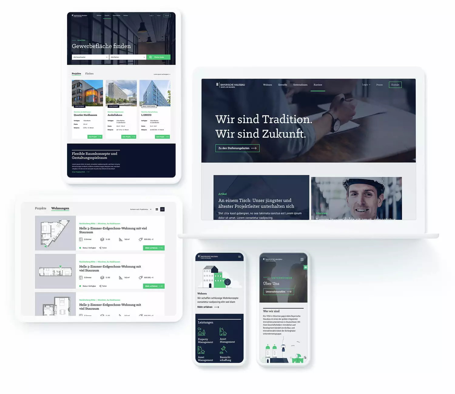
Total makeover for their brand design
Exciting interaction of tradition and modernity
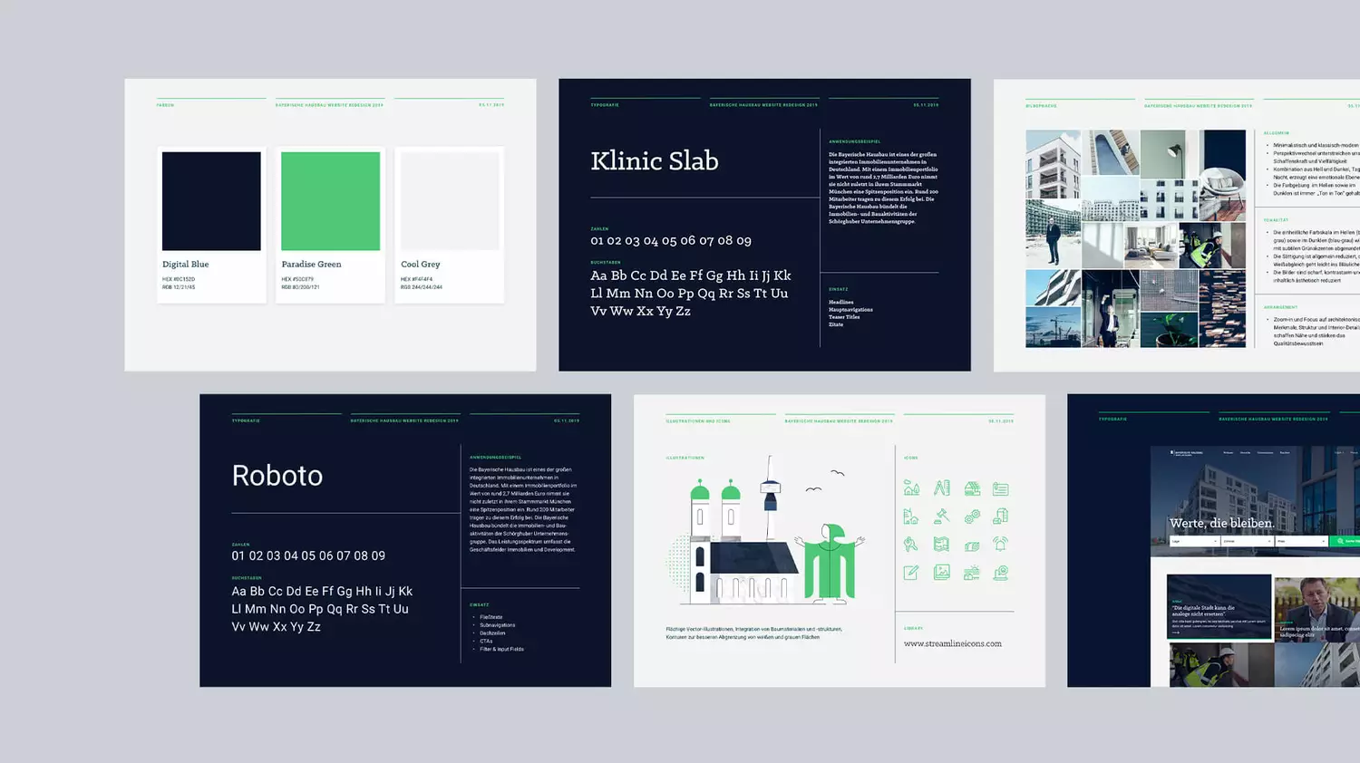
Tradition says: blue is a color that creates trust. Zeitgeist turns it into a powerful digital blue and cleverly combines it with a radiant, yet not too intrusive green and grounds the color world with a light gray.
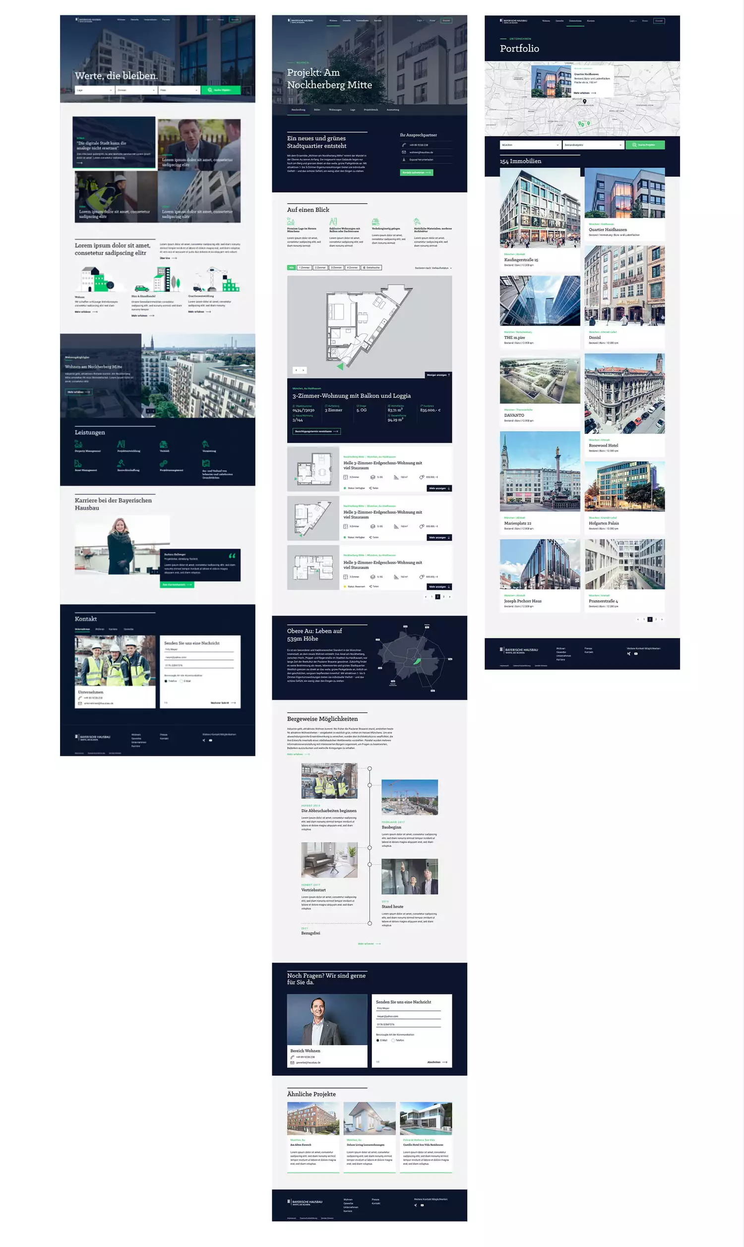
And we maintain this tension in all elements of the design. Instead of the classic serif, we combine the so-called slab variant, which looks very similar to the serif but is more nonchalant. The illustrations combine digital, straightforward graphic elements with tangible stone and wood textures. And the visual language shows clear lines and skillfully focuses on architecture without a lot of chichi and gives the modern edge through exciting perspectives.
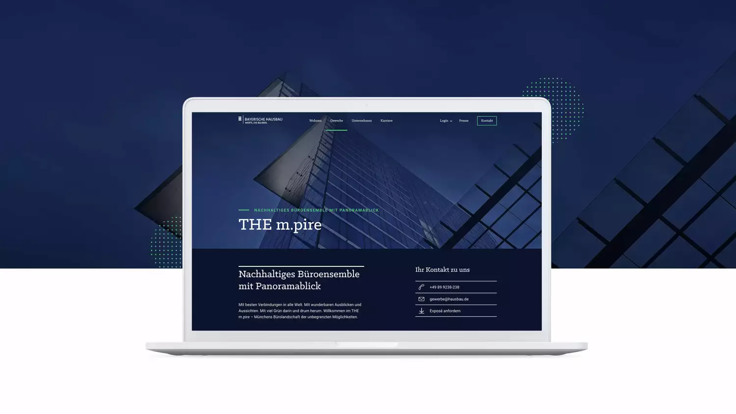
This new brand design was primarily designed for the website relaunch at the time. But it will soon be used across all possible channels and will continue to evolve in order to remain in tune with the spirit of the times without losing its own core.
